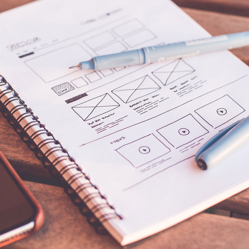
When I’m handed a UI/UX project, my first thought goes to see what is currently on their site and what it is they are looking for. If some inspiration was provided, I will work from that otherwise I search the web for my inspiration. I take those inspirational pieces and do quick sketches of different sections and elements that catch my eye. If I have a design in mind, I will quickly sketch what I’m thinking just to get it on paper. If I don’t draw it right away, there’s a high possibility, I’ll forget it later.
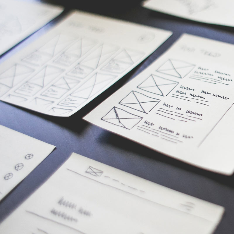
In this stage, my idea is to make as many sketches as possible. These sketches are very plain wireframes with a bunch of squiggly lines and awful looking shapes. I try to get as many possible design layouts as possible so in the next step, I can eliminate, add and fine tune them.
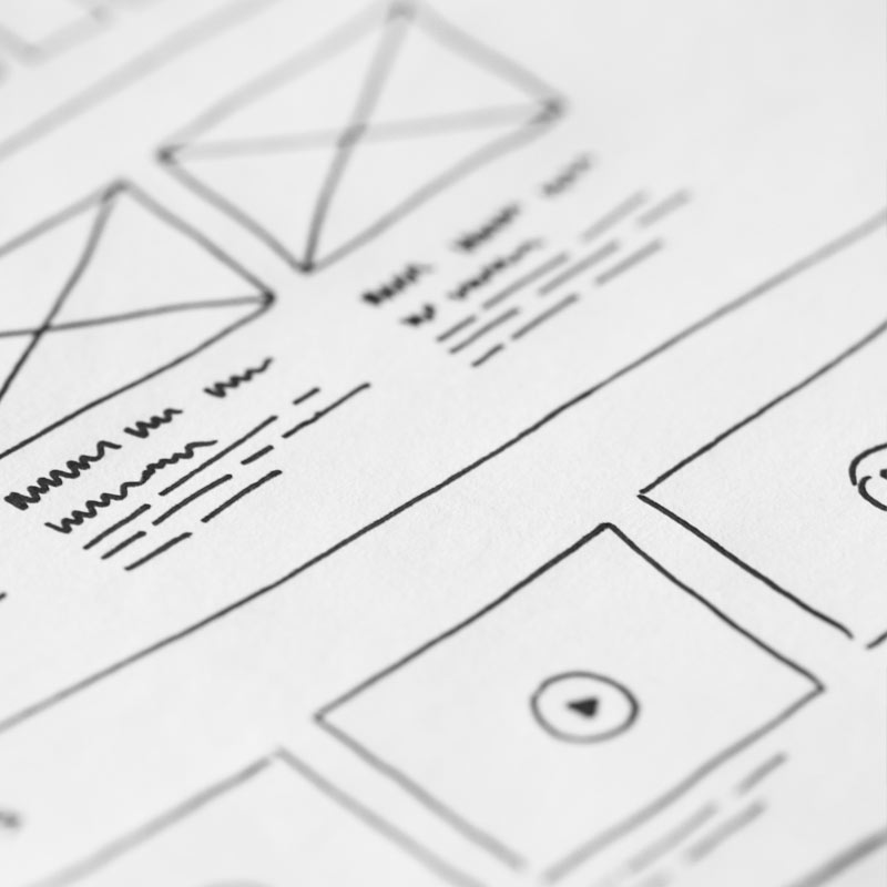
Once I have all these quick sketches, my next step is to refine what I have and think more logically about the functionality of each section. I’ll look at each design sketch and re-sketch cleaner versions to narrow down the options and what will work and what won’t. It makes it easier for me to see quick layouts and being flexible as to how to change them before going into too much detail. At this stage it’s figuring out what looks good and what the functionality for the project will be even down to the smallest of elements.
This step is also having multiple layouts but I always hope to narrow it down to about two design options at this point.
At this point, I've already discussed my two options with my peers and others to break it down to a more finalized version. In this stage, I take one of the designs and start to create a basic Adobe XD wireframe. I’ll begin making the boxes and adding some black, white and gray to it. I’ll also design with placeholder text (lorem ipsum) to give the idea of what the text will look like. This will provide a cleaner layout for others to visualize. If I do have the actual content for these sections, I will go ahead and add that in their places.
I love feedback! I will ask at least one person for some feedback to get a collaborative decision on how they feel about the layout. At this stage, it’s still easier to go back and make major changes so any feedback will be in consideration and adjustments will be made.
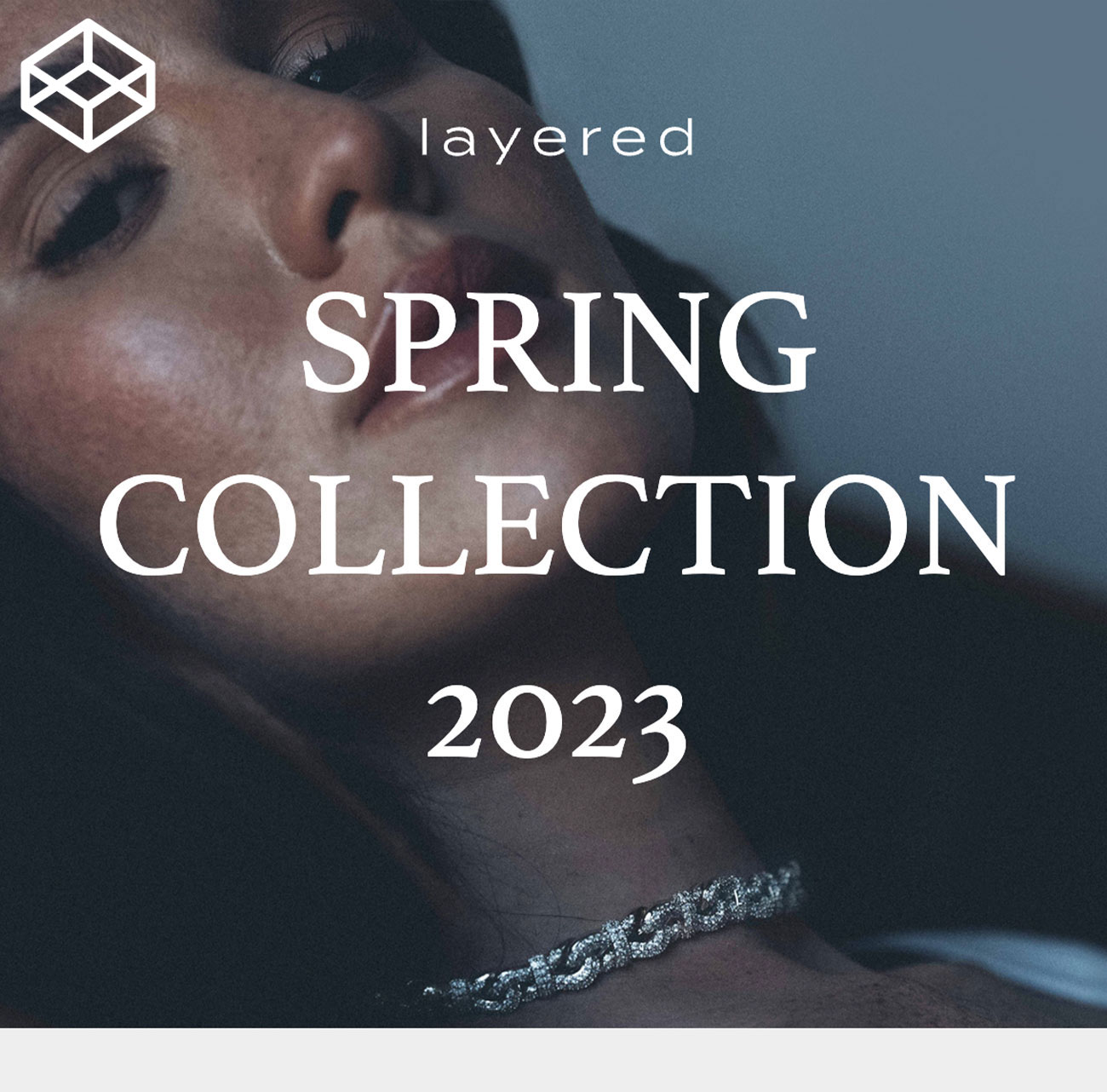
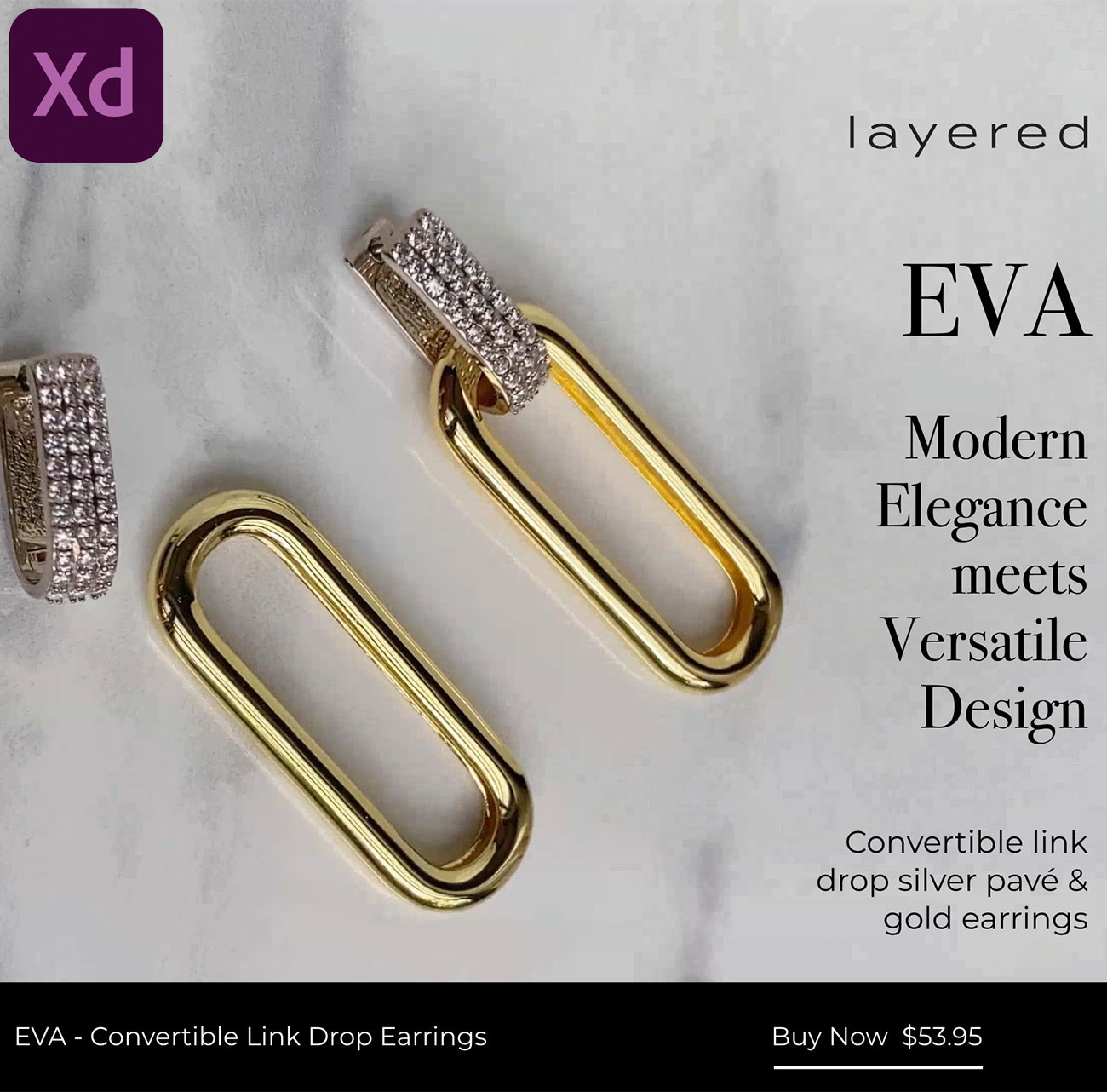
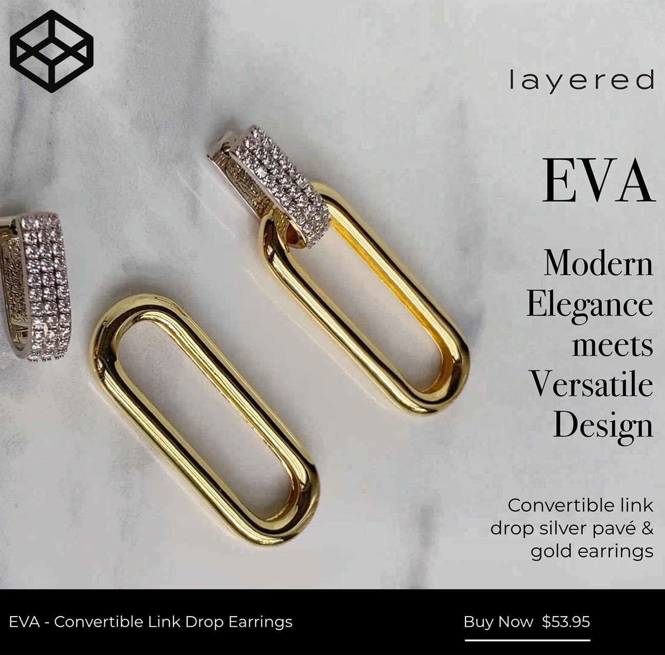
In this step, I will finalize the approved layout with imagery, color, content and animations. I try to make the finalized document look pixel perfect to how the page will look once built. Once I've added in all the information, I will provide a shared Adobe XD link for the end user to experience the overall look and feel of the page. Once I share this link, I will await more feedback with final edits and hopefully will be ready for development.